
Inboxes in 2026 are more crowded than ever, and subscribers decide in about three seconds whether your email is worth their attention. Great email newsletter design is what turns that split-second scan into a click. The good news: you don’t need a developer or a fancy ESP to get this right. You need a repeatable layout system. 10 Newsletter Design Examples, Free Templates, and Tips is a useful companion to this.
Below is a practical walkthrough we use at Rishfeld Designs when helping marketers and small business owners rebuild their newsletters for higher engagement. Each tip is something you can apply directly inside Mailchimp, Klaviyo, Beehiiv, MailerLite, or Canva.
Why Newsletter Layout Matters More Than Copy Length
Most engagement problems people blame on “bad copy” are actually layout problems. When the visual hierarchy is off, readers can’t find the point, the CTA gets lost, and the email feels like homework. A clean structure does three things:
- Guides the eye from headline to CTA in under 5 seconds
- Loads correctly on every phone, no matter the client
- Reinforces brand trust so future emails get opened
8 Layout Tips for Email Newsletter Design That Actually Convert
1. Start With a Mobile-First Single Column
Over 70% of newsletters are now opened on mobile first. Multi-column layouts break, shrink text, or force pinch-to-zoom. Design for a single 600px column that stacks naturally, and treat desktop as the bonus view, not the primary one.
- Body width: 600px maximum
- Side padding: 20 to 24px minimum
- Tap targets (buttons, links): at least 44x44px
2. Build a Clear Visual Hierarchy in the First Screen
The top 300 to 400 pixels are your storefront window. That zone should contain, in order:
- A small, clean logo (not oversized)
- A punchy headline that mirrors your subject line
- One supporting sentence
- The primary CTA button
If a reader stopped scrolling after your hero section, they should still know what the email is about and what to do next.
3. Use One Primary CTA (and Repeat It)
Multiple competing CTAs dilute click-through rate. Pick one main action per newsletter. You can repeat that same CTA two or three times through the layout (top hero, middle content, bottom footer) but it should always point to the same destination.
| CTA Approach | Typical CTR | Best For |
|---|---|---|
| One primary CTA repeated | High | Product launches, promos |
| Two CTAs (primary + secondary) | Medium | Content roundups |
| Four or more CTAs | Low | Rarely recommended |
4. Design CTA Buttons People Can’t Miss
A button should look like a button, not a text link pretending to be one.
- Solid background color with high contrast against the email background
- Minimum height of 44px, ideally 48 to 56px
- Action-first label: “Get my template” beats “Learn more”
- Add 24 to 32px of whitespace above and below the button
5. Pick On-Brand Typography That Survives Every Inbox
Fancy web fonts often fall back to Times New Roman in Outlook and some Gmail apps. Use a web-safe stack that still feels on-brand.
- Modern and clean: Inter, Helvetica, Arial
- Editorial and warm: Georgia, Charter
- Body size: 16 to 18px minimum
- Line height: 1.5 to 1.6 for body copy
- Headline size: 24 to 32px on mobile
Stick to two font sizes for body and two for headings. That is a full type system, no more needed.
6. Use Whitespace as a Design Element
Cramped emails feel like ads. Generous spacing feels like a personal message from a brand that respects the reader. Add breathing room between sections (40 to 60px vertical padding) and never let images touch text edges.
7. Optimize Images Without Killing Load Time
Slow-loading images cause people to close the email before your CTA even renders. Best practices:
- Compress images to under 200KB each
- Total email weight under 1MB
- Always add descriptive alt text (many people read with images off)
- Never put your main headline inside an image, use real text
8. Design a Footer That Builds Trust
Footers are not just legal filler. A well-designed footer improves deliverability and trust:
- Physical address (required for CAN-SPAM and GDPR compliance)
- Clear unsubscribe link, not hidden in tiny gray text
- Preference center link so users can choose fewer emails instead of quitting
- Small social icons, not giant colorful blocks that distract from the CTA
A Simple Newsletter Layout Template You Can Copy
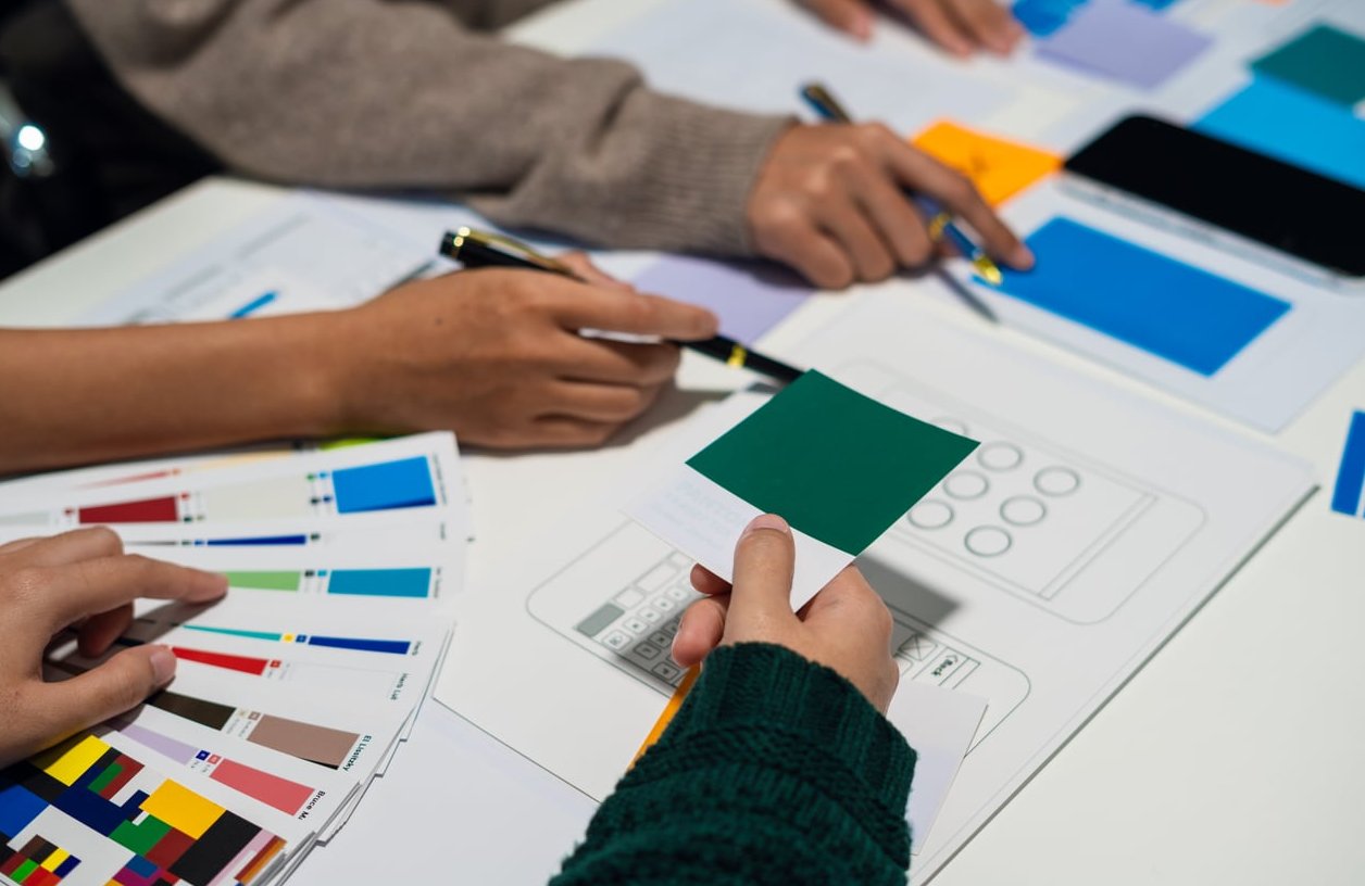
Here is the exact block order we recommend for most B2B and B2C newsletters:
- Logo bar (centered or left-aligned, small)
- Hero headline + one-sentence intro
- Primary CTA button
- Main content block (story, product, or article)
- Secondary content (two stacked cards, not side-by-side on mobile)
- Repeated CTA
- Personal sign-off from a real person
- Footer with address, unsubscribe, and social
Common Newsletter Design Mistakes to Avoid
- Giant hero images that push the CTA below the fold
- Text over busy background images that fails accessibility contrast
- Too many link colors so nothing looks clickable
- Dark mode not tested (transparent PNG logos disappear on black)
- Different design every week so subscribers never learn the pattern
Testing Checklist Before You Hit Send
- Preview in Gmail, Outlook, and Apple Mail (light and dark mode)
- Read only the headlines and CTA, does the story still make sense?
- Check that the primary CTA is visible without scrolling on a phone
- Send a test to yourself and click every link
- Confirm images have alt text and total weight is under 1MB
Frequently Asked Questions
What is the ideal width for email newsletter design?
600 pixels is the standard maximum width. It renders reliably across every major email client and stacks cleanly on mobile. This overview fills in the gaps.
How long should a newsletter be?
Aim for a scroll depth of two to four screens on mobile. If you have more content, link out to your website instead of packing everything inside the email.
Should I use HTML email or plain text?
Designed HTML emails perform better for brands and ecommerce. Plain-text style emails can work well for personal newsletters, founder updates, and B2B sales sequences. Many top performers now use a hybrid: minimal HTML that looks like a real personal email. reallygoodemails.com published something useful on the subject.
What is the best font size for email newsletters?
Body copy should be 16 to 18px, headlines 24 to 32px on mobile. Anything smaller than 14px is a readability risk.
How often should I redesign my newsletter template?
Refresh the visual system every 12 to 18 months, but keep the core structure stable. Subscribers learn your layout, and consistency actually improves click-through rates over time.
Final Thought
Great email newsletter design is not about looking impressive, it is about being effortless to read and act on. Get the hierarchy, CTA, and mobile structure right, and every other metric (opens, clicks, replies) will follow. If you want a custom newsletter template designed around your brand and audience, the team at Rishfeld Designs can build one you’ll be proud to send every week.