

Picking typography for a brand is rarely about scrolling through Google Fonts until something looks pretty. At Rishfeld Designs, we treat font selection as a structured decision process, the same way we treat color systems or logo construction. In this guide, we walk you through the exact framework our team uses when clients ask how to choose fonts for a brand, so you can apply it to your own projects with confidence.
Why a Decision Framework Beats a List of “Best Fonts”
Most articles on this topic hand you a list of trendy typefaces and call it a day. The problem? A font that works beautifully for a luxury skincare brand will sabotage a fintech startup. Instead of memorizing favorites, we use a five-step decision framework that produces the right answer for any brand brief.
Here is the framework at a glance:
- Define the brand personality in measurable traits
- Map traits to typographic categories
- Stress test for readability across mediums
- Build a font system, not a font pick
- Verify licensing before you commit

Step 1: Translate Brand Personality Into Typographic Traits
Before opening any font library, write down three to five adjectives that describe the brand. Then translate those adjectives into typographic characteristics. Vague words like “modern” or “premium” are useless until you convert them into visual decisions.
Personality to Typography Translation Table
| Brand Trait | Typographic Direction | Example Categories |
|---|---|---|
| Trustworthy, established | Classic serifs, balanced proportions | Transitional serif, old-style serif |
| Innovative, tech-forward | Geometric, neutral, low contrast | Geometric sans, neo-grotesque |
| Warm, human, artisanal | Humanist forms, soft terminals | Humanist sans, slab serif |
| Luxury, editorial | High contrast, refined details | Didone, modern serif |
| Playful, youthful | Rounded shapes, irregular rhythm | Rounded sans, display script |
Step 2: Match the Right Category to Your Use Case
Once you know the category, narrow down by function. A brand needs typography that serves three core roles:
- Display type for headlines, hero sections, packaging fronts, and ad creative
- Body type for paragraphs, product descriptions, and long-form content
- Functional type for UI labels, captions, legal text, and data tables
A font that wins on a billboard often fails at 11px in a checkout form. Always evaluate candidates in the actual context where they will live.
Step 3: Stress Test for Readability Across Mediums
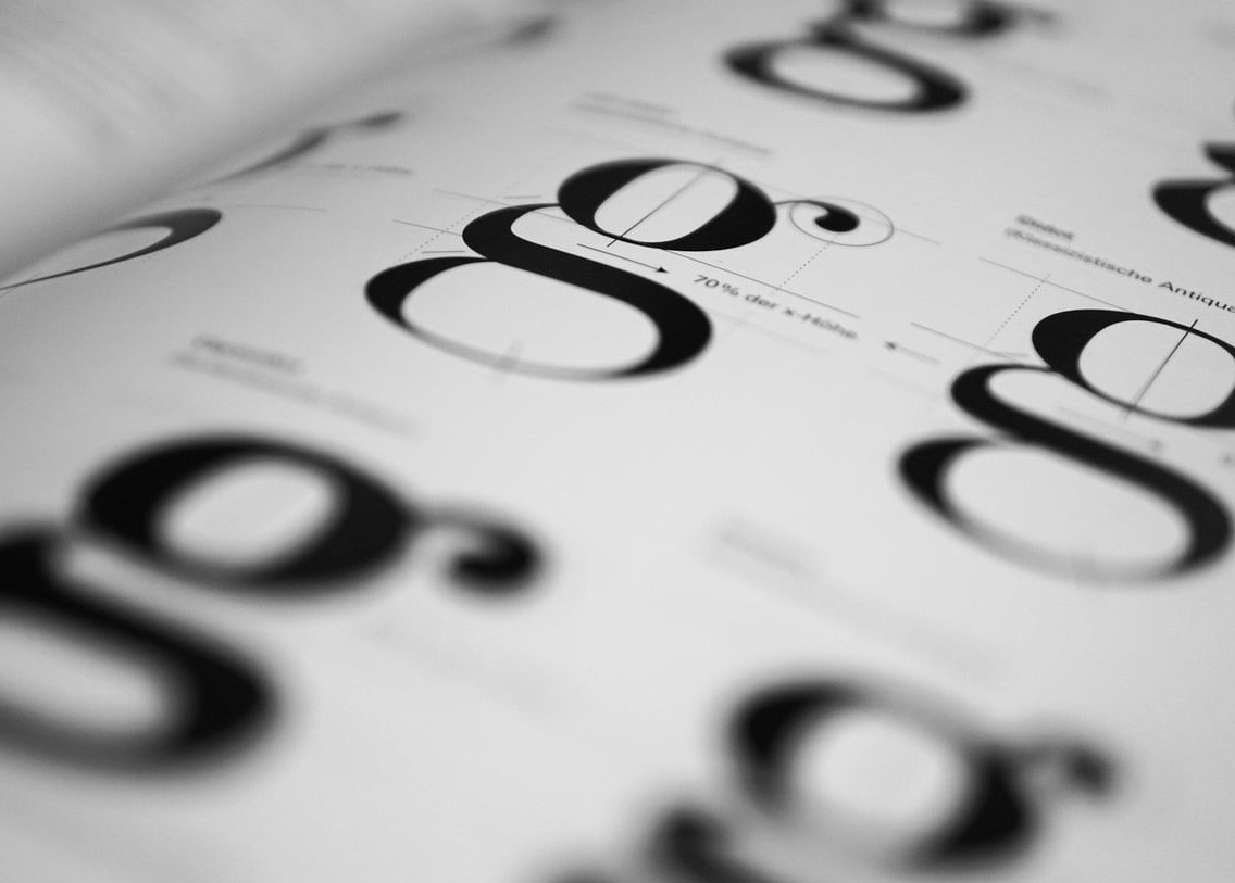
This is where most brand fonts collapse. Before locking in a choice, run it through a readability audit. Here is the checklist we use at Rishfeld Designs in 2026:
- Render at 12px, 16px, and 64px on a Retina display and a standard monitor
- Print a test sheet at 9pt, 11pt, and 24pt to check ink behavior
- Test on mobile in both light and dark mode
- Check character disambiguation: capital I, lowercase l, number 1, and zero versus capital O
- Read a full paragraph out loud, then a single product name in isolation
- Verify multilingual support if the brand operates across regions
Fonts that pass all six tests are candidates. Fonts that fail even one get cut, regardless of how attractive they look in a moodboard.
Step 4: Build a Font System, Not a Single Pick
A brand needs a typographic system. Our recommendation is to work with two typefaces maximum, then exploit weights and styles within each family to create hierarchy. This keeps brands flexible without sacrificing consistency.
The Two Font System We Recommend
| Role | Function | Typical Choice |
|---|---|---|
| Primary | Headlines, logo wordmark support, brand voice | Distinctive display or serif |
| Secondary | Body copy, UI, functional text | Neutral, high-legibility sans |
Pairing Principles That Always Work
- Contrast in structure, harmony in mood: pair a serif headline with a sans body if both share similar x-height and weight rhythm
- Avoid same-category clashes: two geometric sans serifs together usually look like a mistake
- Check the cap height and x-height ratio: mismatched proportions break visual flow

Step 5: Verify Licensing Before You Commit
This is the step that gets ignored most often, and it can cost brands thousands. In 2026, font licensing has become more complex with the rise of variable fonts, web apps, and AI-generated content usage. Before finalizing your typography, confirm the following:
- Desktop license: covers static documents and design files
- Web license: usually based on monthly pageviews, check your tier
- App and ebook licenses: separate from web, often required for SaaS products
- Broadcast and advertising rights: needed for video content and paid social
- Logo embedding rights: some foundries restrict use inside trademarked marks
Google Fonts and other open-source libraries simplify this with SIL Open Font License coverage, but premium foundry fonts almost always require tiered purchases. Always read the EULA, not just the marketing page.
Common Mistakes to Avoid
- Choosing a font because it is trending on design platforms this season
- Picking display fonts with only two weights, leaving no room for hierarchy
- Ignoring how the font renders on Android versus iOS
- Forgetting accented characters for European or Latin American markets
- Locking in a font before checking if it has a variable version for performance
A Quick Worked Example
Imagine a sustainable home goods brand. The traits are warm, honest, and modern. Following the framework:
- Personality mapping: humanist sans for warmth, paired with a soft modern serif for editorial credibility
- Readability test: both candidates must read cleanly on product packaging and on mobile e-commerce
- System build: serif for product names and editorial headers, sans for navigation, descriptions, and checkout
- Licensing: confirm packaging counts as commercial print, secure broadcast rights for upcoming video ads
The result is a typography system that reflects the brand and survives every real-world application.
FAQ
How many fonts should a brand use?
Two is the sweet spot for most brands. One primary for personality, one secondary for function. Use weights and styles within each family to create variety instead of adding more typefaces.
What is the 3 font rule?
The 3 font rule suggests using up to three typefaces or three distinct weights to create hierarchy: one for headers, one for body, and one for accents. We recommend leaning closer to two fonts and treating the third as a weight variation rather than a separate family.
Are free fonts good enough for professional brands?
Yes, many open-source fonts like Inter, Source Serif, and Public Sans are production-grade. The risk is ubiquity, since other brands use them too. If distinctiveness matters, invest in a licensed foundry font or a custom typeface.
Should the logo font and the brand font be the same?
Not necessarily. Logo wordmarks are often customized letterforms and do not need to match the brand system exactly. What matters is that the logo and the brand typography feel like they belong to the same family in tone and proportion.
How do I know if a font will age well?
Look at fonts that have already survived multiple decades and still feel current. Avoid heavy stylistic gimmicks tied to a specific trend. A well-crafted typeface with a full character set and multiple weights tends to outlast fashion cycles.
Choosing typography for a brand is a decision process, not a taste contest. Use this framework, test rigorously, and your fonts will do real work for the brand rather than just decorating it. If you want help applying this method to your own project, the Rishfeld Designs team is ready to collaborate.