
A great poster does more than look pretty. It tells your eyes exactly where to go, what to read first, and what to remember. That guided journey is called visual hierarchy, and it is the single most important skill separating amateur posters from professional ones.
At Rishfeld Designs, we have spent years crafting posters for events, brands, and cultural campaigns. In this guide, we break down nine practical techniques our designers use every day to control where the viewer looks first, second, and third. Whether you are designing a concert poster, a film promo, or a product launch, these methods will help you build layouts that communicate clearly and instantly.
What Is Visual Hierarchy in Poster Design?
Visual hierarchy is the deliberate arrangement of elements so the viewer processes information in a specific order. On a poster, you typically have three layers of priority:
- Primary information: the headline, event name, or main subject
- Secondary information: date, location, supporting visuals
- Tertiary information: credits, sponsors, fine print, URLs
Without hierarchy, every element shouts at the viewer at once, and nothing gets heard. With it, the eye glides through the composition in a controlled, almost cinematic way.
Why Visual Hierarchy Matters More Than Ever in 2026
Posters now compete with feeds, screens, and walls of stimulation. Studies on attention show that viewers decide whether to engage with a visual in under three seconds. A clear hierarchy ensures your message lands before the viewer moves on. It also builds trust: a well-organized poster feels professional, intentional, and credible.
9 Techniques to Guide the Viewer’s Eye
1. Use Dramatic Scale Differences
Size is the fastest hierarchy tool you have. The biggest element on the page becomes the visual anchor. Do not be timid: a 300-point headline next to 12-point body copy creates instant clarity.
Real-world example: Swiss-style concert posters from designers like Mike Joyce push band names to massive proportions while keeping venue details compact at the bottom. The eye knows immediately what the poster is about.
Tip: Aim for at least a 3:1 ratio between your primary text and secondary text.
2. Leverage Contrast in Color and Value
Contrast pulls the eye toward what stands out. A single bright element on a muted background will always win the first glance. Think of high-contrast pairings: black on yellow, white on deep red, neon on charcoal.
Example: Saul Bass film posters use a single bold color against flat backgrounds to draw attention to a symbolic shape before the title is even noticed.
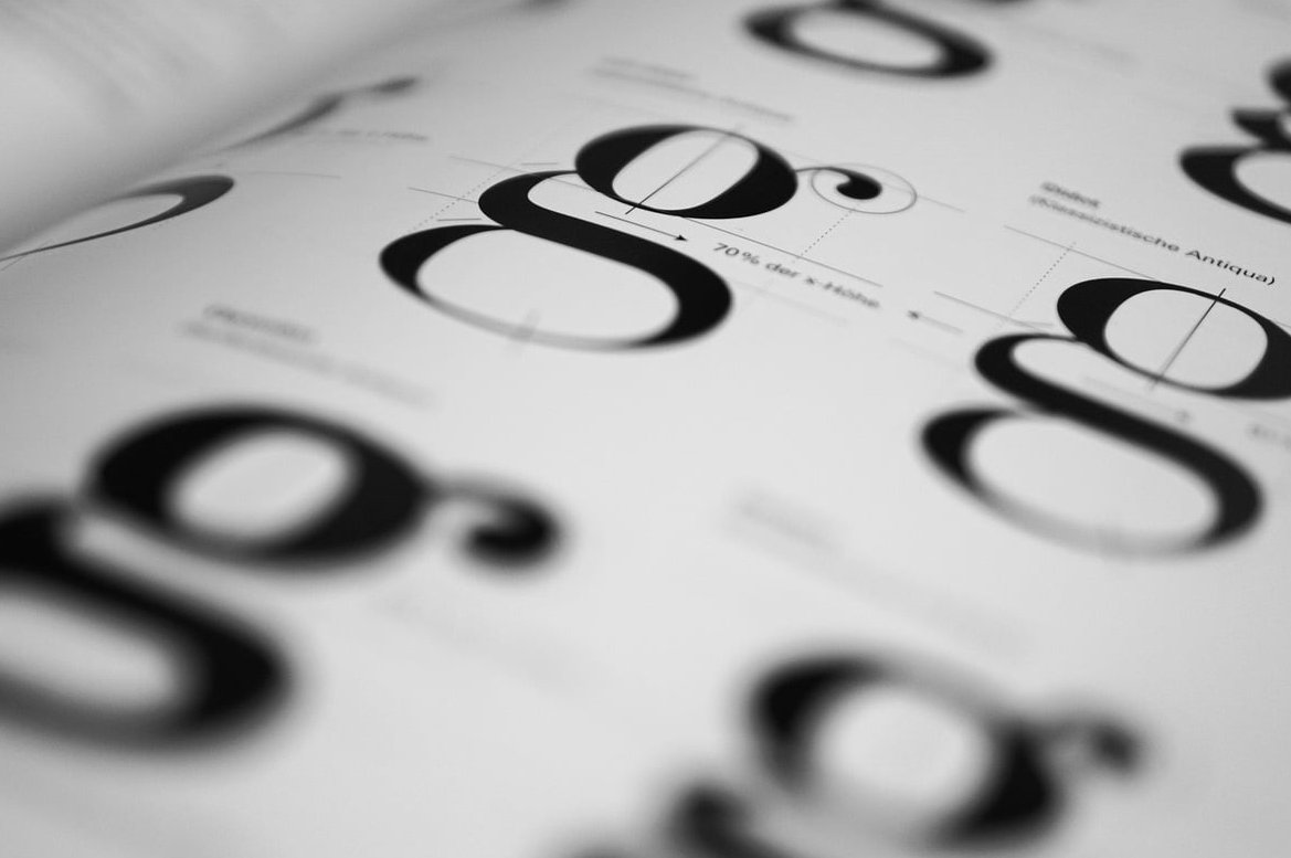
3. Master Typography Weight
Weight is the thickness of a typeface. Pairing a heavy black weight with a thin light weight creates instant priority without needing different sizes. This is a favorite technique for editorial-style posters.
| Weight | Typical Use |
|---|---|
| Black / Heavy | Headlines, main subject |
| Bold | Subheads, key dates |
| Regular | Body text, descriptions |
| Light / Thin | Credits, fine print |
4. Control Spacing and White Space
Empty space is not wasted space. Generous spacing around a key element isolates it and tells the eye, “look here first.” Crowded layouts flatten hierarchy because everything competes equally.
Practical rule: Give your primary element at least twice as much breathing room as everything else.
5. Direct the Eye With Composition Lines
Use implied lines, arrows, gazes, or diagonal elements to point the viewer toward what matters. A photograph of a person looking off-frame naturally pulls attention in that direction. Use this to guide the eye from headline to date to call-to-action.
6. Apply the Z-Pattern or F-Pattern Layout
Western viewers scan visuals in predictable shapes:
- Z-pattern: top-left, top-right, bottom-left, bottom-right. Ideal for posters with one strong headline and a clear CTA.
- F-pattern: heavy reading on the left, lighter scanning down. Better for text-dense posters like film festival lineups.
Place your most important elements along these natural eye paths.
7. Group Related Elements With Proximity
The Gestalt principle of proximity tells us that elements placed near each other are perceived as related. Group your date, time, and venue together. Separate them from the headline with clear space. This chunks information into digestible blocks instead of one long noisy list.
8. Use Color Temperature to Layer Depth
Warm colors (red, orange, yellow) advance toward the viewer. Cool colors (blue, green, purple) recede. Use this to push background elements back and pull foreground elements forward, creating a sense of depth that reinforces hierarchy.
Example: A poster with a cool blue background and a single warm orange headline almost forces the eye onto the title.
9. Break the Grid for Strategic Emphasis
Once you have established a clean grid, breaking it intentionally on one element creates a focal point. A tilted word, a logo that extends past the margin, or a photograph that bleeds off the edge all stand out because they violate the order you built.
Use this technique sparingly. Break the grid for one element only, or the effect disappears.
A Simple Workflow for Building Hierarchy
Here is the step-by-step process our team at Rishfeld Designs follows on every poster project:
- List your information and rank it from most to least important.
- Sketch three rough thumbnails trying different focal points.
- Apply scale first, then contrast, then weight.
- Squint at your design. The biggest, boldest element should still dominate.
- Test with a stranger. Ask them what they see first, second, third. If their answers match your intended order, the hierarchy works.
Common Mistakes That Destroy Hierarchy
- Making everything bold: if everything shouts, nothing is heard
- Too many fonts: stick to two typefaces maximum
- Equal sizing across elements: flattens the layout
- Overcrowding: every element needs room to breathe
- Random color use: limit your palette to three or four colors with clear roles

Final Thoughts
Visual hierarchy in poster design is not decoration. It is direction. Every choice you make about size, contrast, spacing, and typography is a small instruction telling the viewer where to look next. Master these nine techniques and your posters will stop being passive images and start being active guides.
If you want a poster that does this work for you, our team at Rishfeld Designs would love to collaborate. Get in touch to see how we can help your next campaign cut through the noise.
FAQ
What are the most important elements of visual hierarchy in a poster?
Scale, contrast, typography weight, and spacing are the four pillars. Scale establishes the focal point, contrast pulls the eye, weight adds priority without size changes, and spacing isolates important elements.
How many focal points should a poster have?
Usually one strong focal point, supported by two or three secondary elements. More than that and the hierarchy starts to collapse.
Can I use multiple typefaces in a poster?
Yes, but limit yourself to two. Pair a display font for the headline with a clean sans-serif or serif for supporting text. Variety should come from weight and size within the same family, not from adding new fonts.
What is the difference between visual hierarchy and composition?
Composition is the overall arrangement of elements on the page. Visual hierarchy is the specific aspect of composition that controls the order in which elements are seen. Hierarchy lives inside composition.
How do I test if my poster has good visual hierarchy?
Squint at it from across the room. If you can still identify the main message in under two seconds, your hierarchy is working. You can also show it to someone unfamiliar with the project and ask them what they noticed first.